After researching different types of fonts using the website www.dafont.co.uk I experimented with using different genres of fonts.
 |
I found that Calligraphy was too decorative and did not appeal to my target audience, through failing to bare a strong link to my CD and Magazine advert. |
 |
Graffiti had a similar problem because it did not comply with the type of music included in my Music Video, (Indie). |
 |
I then tried 'Old School' which was a definite possibility but nothing could compete against.... |
 |
After researching so many fonts all over the internet, I have decided on a font called... "Savia Outline". I have chosen this font because it stands out of the page, and looks quite quirky and different. I really didn't want a normal font like Garamond, or Nueva because they were unique enough, and were known to word. My font will now be linked to my album and nothing therefore there is a strong lack of intertextuality giving my product a unique and professional touch.
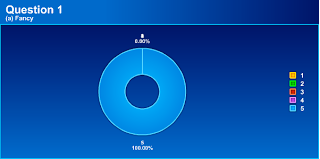
I decided to include my target audience in this decision, therefore I made a survey and had friends and family fill it out, after watching the Music Video so far.
Here are the results...
Here are some of their comments on the font choice...
|


No comments:
Post a Comment