I have decided to create a hard copy to give me an edge because I not only have the images, but I have an actual CD that looks very professional.
I've measured out the dimensions 12cm x 12cm for the front page and the lyrics booklet, and 13.8cm x 12cm for the back page.
I will print it out on card to make sure it is sturdy and thick enough so that the ink won't show through from the other side because it's double sided!
After a few complications with printer ink, I replaced the cartridges and using my Laser Printer at home have created some stunning images that I am very proud of!
I've included a bar code, and the copy write information, as well as the productions company and the logo so that it will appear as a professional and REAL CD.
Dont worry... I'll take pictures!
Monday, 28 February 2011
Saturday, 26 February 2011
Choosing The Font
After researching different types of fonts using the website www.dafont.co.uk I experimented with using different genres of fonts.
 |
I found that Calligraphy was too decorative and did not appeal to my target audience, through failing to bare a strong link to my CD and Magazine advert. |
 |
Graffiti had a similar problem because it did not comply with the type of music included in my Music Video, (Indie). |
 |
I then tried 'Old School' which was a definite possibility but nothing could compete against.... |
 |
After researching so many fonts all over the internet, I have decided on a font called... "Savia Outline". I have chosen this font because it stands out of the page, and looks quite quirky and different. I really didn't want a normal font like Garamond, or Nueva because they were unique enough, and were known to word. My font will now be linked to my album and nothing therefore there is a strong lack of intertextuality giving my product a unique and professional touch. I decided to include my target audience in this decision, therefore I made a survey and had friends and family fill it out, after watching the Music Video so far. Here are the results...          Here are some of their comments on the font choice...  |
Thursday, 24 February 2011


Tuesday, 22 February 2011
Experiments In Photoshop
 |
This image was experimented with using Adobe Photoshop, and features a Filter named 'Plastic Wrap'. I used this filter to denote suffocation and the Music Video features a break up between her and her boyfriend "because i can't breath without you baby...". After experimenting with this image, I have found that the image is too abstract for my piece and does not fit the CD genre. |
 |
I really like the bright colours bursting out of this photograph although the effect 'Glow Light' also applied using Adobe Photoshop unfortunately makes seeing any facial features impossible, therefore the modeling type shoot I took was pointless if not to show of her beauty. I also feel it is too abstract and does not achieve the right look that I am attempting to achieve. |
 |
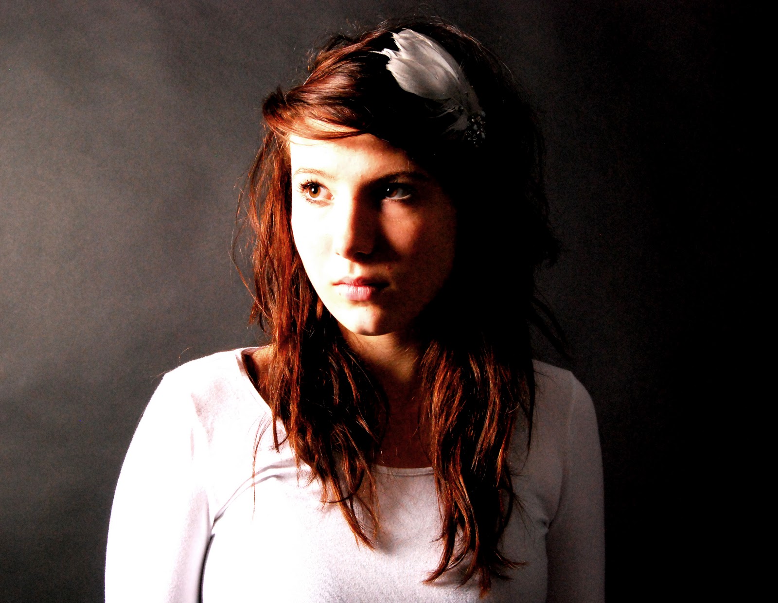
I really like this sepia tone image, focusing on a close up of the models face. Her smile is not planned but because it is not a grin and is nothing cheesy I think it can potentially work at the front of my CD cover. Because of the direction of the light, pointing towards the left of her face (in the image) the right half has been blacked out and although this masks a lot of her face I still really like the affect and because the model appears so silent and natural it therefore connotes pure beauty. |
 |
I have used a black and white effect for this image, focusing on the model's body as she sits on a stool with enclosed body language denoting loneliness. I took this image full aware that half of her face was missing although I do think it is very beautiful, I do not feel it is powerful enough to grab the readers attention to pick out my CD! I feel if her eyes were included they would attract attention and be the selling point of the image. |
 |
This is a definite favourite! The grainy filter, applied using Adobe Photoshop connotes and denotes the fact that she is surrounded by darkness (after her break up with her boyfriend). I asked her to look down denoting sadness as she collapses onto a stool in a heartbroken state! This image is a definite MUST USE! |


Monday, 21 February 2011
My Photo Shoot Outcome 20/02/2010


 |
I have enlarged the images that are my favourite and the ones I aim to focus on during my project. |
Subscribe to:
Comments (Atom)